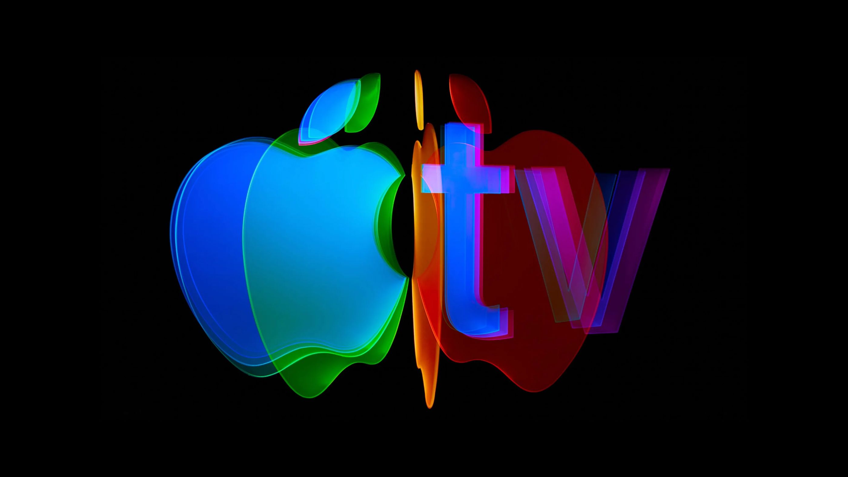
A clean visual system developed over two years, contributing to the evolution of one of the world’s leading streaming platforms.
Apple TV had a recognition problem. People watched the shows and films. They didn't always remember where they came from. As households cut back on streaming services, Apple TV had to fight for its spot in the lineup. The ambition was to build a brand as cinematic as the shows and films that follow it, a badge of intent, not just an identity. The insight: white and black contain all colors. A bold palette, paired with glass, cinematic motion, and confident typography, created an identity with the weight to do that. Apple TV still stands for quality. It's just done whispering about it.
Hermes Miranda worked across the full scope of the rebrand with Media Arts Lab Team, helping to define the visual system that supports Apple TV globally. The work included the development of layouts, prototypes, and visual concepts, as well as the expansion of the platform’s visual expression across multiple digital platforms. A key focus was building a cohesive and scalable system, where typography, composition, and motion work together to create a consistent experience.
Global Head of Design
James Taylor
Design Director
Sabine Dowek
Lara Julians
Design
Hermes Miranda
Jackie Rodriguez
Brian Kim
Aiqi Zhang
- Cannes Lions – Grand Prix, Design Craft: Rebranding
- ADC Awards – Gold Cube: Craft in Motion
- D&AD – Silver Pencil, Art Direction: Digital Platforms